
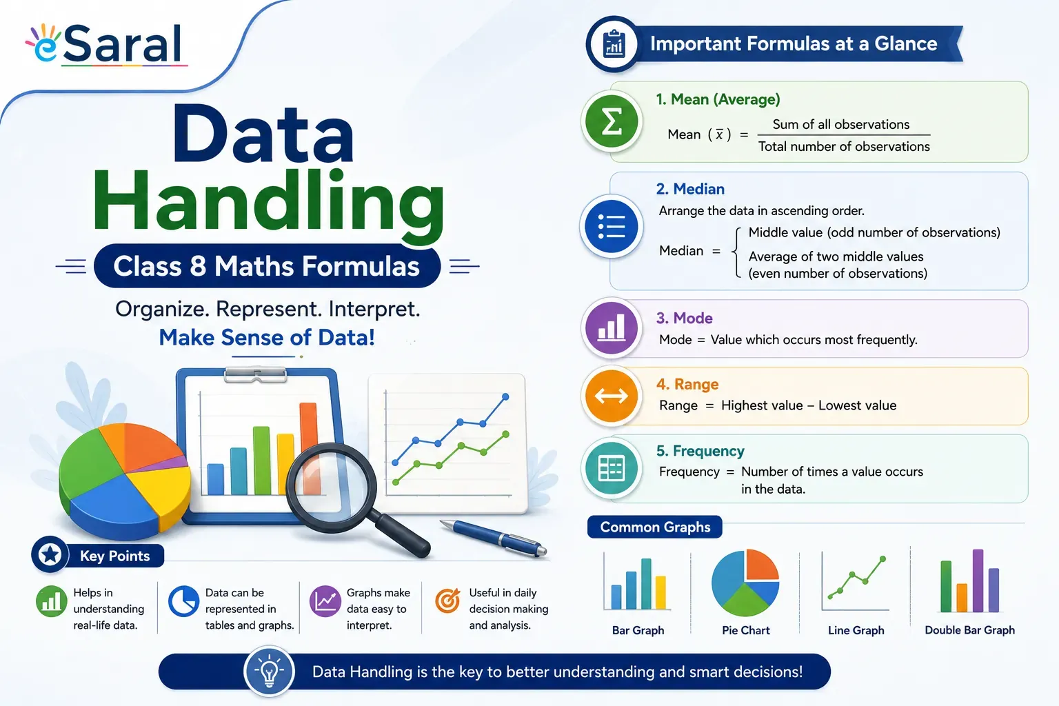
Data Handling Class 8 Maths Formulas
Home > Class 8 Maths Formulas > Data Handling Class 8 Maths Formulas

What Is Data Handling in Class 8 Maths?
Data Handling of the NCERT Class 8 Maths textbook. It introduces students to the organized collection, presentation, and interpretation of numerical information. The chapter covers five core topics: frequency distribution, histograms, pie charts, probability, and measures of central tendency (mean, median, and mode covered in related chapters).
Mastering this chapter is important not just for school exams — it also builds the statistical thinking needed for competitive exams later. Students who understand these formulas well find questions on data interpretation much easier in exams like JEE Main and NEET entrance tests down the road.
Note: This page covers all formulas from NCERT Class 8— Data Handling. Bookmark it for quick revision before exams.
All Data Handling Class 8 Formulas at a Glance
| Concept | Formula |
|---|---|---|
1 | Range | Highest Observation − Lowest Observation |
2 | Class Mark | (Upper Limit + Lower Limit) ÷ 2 |
3 | Central Angle (Pie Chart) | (Value of Item ÷ Sum of All Values) × 360° |
4 | Probability of Event E | Favourable Outcomes ÷ Total Possible Outcomes |
5 | Complementary Probability | P(E) + P(not E) = 1 |
6 | Probability Range | 0 ≤ P(E) ≤ 1 |
7 | Frequency | Count of times an observation appears in data |
This table is your fastest revision tool. Screenshot it or bookmark this page before your exam.
Key Definitions You Must Know
What Is Data?
Data refers to numerical observations collected by an observer, also called raw data. For example, the marks scored by 30 students in a Maths test is a dataset.
What Is Frequency?
Frequency is the number of times a particular observation appears in a given dataset. If 5 students scored 80 marks, the frequency of the observation "80" is 5.
What Is a Frequency Distribution?
A Frequency Distribution is an organized table that shows each value (or class interval) and how many times it appears. It converts raw, unorganized data into a readable format.
What Is a Random Experiment?
A Random Experiment is any activity whose outcome cannot be predicted with certainty. Tossing a coin, rolling a dice, or drawing a card from a shuffled deck are classic examples.
What Is the Formula for Range in Data Handling?
Range tells you how spread out your data is — the gap between the highest and lowest values.
Range = Highest Observation − Lowest Observation
Example: If the highest mark in a class test is 95 and the lowest is 40, then:
Range = 95 − 40 = 55
A larger range means the data is more spread out. A smaller range means the values are clustered closely together.
Range is the simplest measure of dispersion, but it only uses two values from the entire dataset. When you reach Class 9 and 10, you'll learn about more reliable measures like Mean Deviation and Standard Deviation. Build the habit now of always identifying the highest and lowest values before solving any statistics problem.
What Is the Class Mark Formula?
The Class Mark (also called the mid-value) of a class interval is the average of its upper and lower limits. It represents the entire class interval with a single number.
Class Mark = (Upper Limit + Lower Limit) ÷ 2
How to Find Class Mark — Quick Steps
- Identify the lower limit and upper limit of the class interval.
- Add them together.
- Divide the sum by 2.
Example: For the class interval 20–30:
Class Mark = (20 + 30) ÷ 2 = 25
Class Interval | Lower Limit | Upper Limit | Class Mark |
|---|---|---|---|
10 – 20 | 10 | 20 | 15 |
20 – 30 | 20 | 30 | 25 |
30 – 40 | 30 | 40 | 35 |
40 – 50 | 40 | 50 | 45 |
Pie Chart (Central Angle) Formula Explained
A Pie Chart (also called a Pie Diagram) represents data as sectors of a circle. Each sector's size is proportional to the value it represents.
Central Angle = (Value of a Particular Component ÷ Sum of All Values) × 360°
Step-by-Step: How to Calculate Central Angle
- Find the value of the component you want to represent.
- Find the total (sum of all values).
- Divide the component value by the total.
- Multiply by 360°.
Example: In a survey, 150 students prefer cricket out of 600 total students.
Central Angle = (150 ÷ 600) × 360° = 0.25 × 360° = 90°
This means cricket takes up a 90° sector in the pie chart — exactly one quarter of the circle.
Quick Check: When you add up all the central angles in a pie chart, they must always equal 360°. Use this to verify your calculations.
What Is the Probability Formula in Class 8?
Probability measures how likely an event is to occur, expressed as a number between 0 and 1.
P(E) = Number of Favourable Outcomes ÷ Total Number of Possible Outcomes
Important Probability Rules
Rule | Statement | Example |
|---|---|---|
Complementary Rule | P(E) + P(not E) = 1 | P(Head) + P(Tail) = 1 |
Impossible Event | P(E) = 0 | Getting 7 on a standard dice |
Certain/Sure Event | P(E) = 1 | Getting a number ≤ 6 on a dice |
Range of Probability | 0 ≤ P(E) ≤ 1 | Always true for any event |
Worked Example: Tossing a Coin
A fair coin is tossed once. What is the probability of getting a Head?
- Favourable outcomes = 1 (only Heads)
- Total outcomes = 2 (Heads or Tails)
- P(Head) = 1 ÷ 2 = 0.5
Worked Example: Rolling a Dice
What is the probability of getting an even number on a single roll of a dice?
- Even numbers on a dice: 2, 4, 6 → 3 favourable outcomes
- Total outcomes: 1, 2, 3, 4, 5, 6 → 6 total outcomes
- P(Even) = 3 ÷ 6 = 0.5
Probability is one of the most frequently tested topics across all competitive exams — from school boards to JEE Main. Students taught by Kota-trained faculty at eSaral consistently find that mastering the basics in Class 8 makes advanced probability in Class 11–12 significantly easier. Don't skip the practice questions — the concept clicks much faster with examples than with definitions alone.
Histogram — How It Differs from a Bar Graph
A Histogram is a special bar diagram used to represent grouped (continuous) data. Here is what makes it different from a regular bar graph:
Histogram vs Bar Graph Comparison
Feature | Histogram | Bar Graph |
|---|---|---|
Type of Data | Grouped / Continuous | Discrete / Categorical |
Gaps Between Bars | No gaps | Gaps present |
X-axis shows | Class intervals | Categories (e.g., subjects) |
Y-axis shows | Frequency | Frequency or value |
Bar width | Represents class width | Usually equal, decorative |
How to Read a Histogram
- The horizontal axis (X-axis) shows class intervals (e.g., 0–10, 10–20).
- The vertical axis (Y-axis) shows the frequency of each class.
- The height of each bar = frequency of that class interval.
- There are no gaps between bars because the class intervals are continuous.
For fully solved NCERT exercises on histograms and bar graphs, explore the NCERT Solutions for Class 11 Maths, where graphical representation concepts are extended further.
Worked Examples for Each Formula
Example 1 — Range
Marks of 7 students: 45, 67, 89, 34, 78, 55, 92
- Highest = 92, Lowest = 34
- Range = 92 − 34 = 58
Example 2 — Class Mark
Class interval: 60–70
- Class Mark = (60 + 70) ÷ 2 = 65
Example 3 — Central Angle (Pie Chart)
Favourite fruit survey (total = 200 students): Mango = 80
- Central Angle = (80 ÷ 200) × 360° = 144°
Example 4 — Probability
A bag has 3 red balls, 2 blue balls, and 5 green balls. Probability of picking a blue ball?
- Favourable outcomes = 2
- Total outcomes = 10
- P(Blue) = 2 ÷ 10 = 0.2
Data Handling Class 8 Maths Formulas
- Data: Numerical observations collected by an observer is called data (raw data).
- Frequency: The number of times an observation occurs in the given data is called the frequency of the observation.
- Frequency Distribution: A way of presenting data that exhibits the values of the variable and corresponding frequencies is called a frequency distribution.
- Range: The difference between the highest and the lowest values of observation is called the range. i.e.,
Range = Highest observation – Lowest observation - Class-mark: The mid-point of a class interval is called the class-mark.
Class-mark $=\frac{\text { Upper limit + Lower limit }}{2}$ - Histogram: Grouped data can be presented using the histogram. A histogram is a type of bar diagram, where the class intervals are shown on the horizontal axis and the height of the bars show the frequency of the class interval. Also, there is no gap between the bars as there is no gap between the class intervals.
- Pie-chart or Pie-diagram: A pie-chart is a pictorial representation of the numerical data by non¬intersecting adjacent sectors of the circle such that area of each sector is proportional to the magnitude of the data represented by the sector.
Central angle $=\frac{\text { Value of a particular mode }}{\text { Sum of the value }} \times 360^{\circ}$ - Probability: Probability is the possibility and impossibility of an event (E).
Probability of an event $(E)=\frac{\text { Favourable outcomes }}{\text { Total number of possible outcomes }}$ and $P(E)+P($ not $E)=1$, i.e., $0 \leq P(E) \leq 1$
Probability of an event can have a value from 0 to $1 .$
The probability to a sure event is 1.
Probability of an impossible event is 0. - Random Experiment: A random experiment is one whose outcome cannot be predicted exactly in advance
- The mid-value of a class is called the class mark.
Class Mark $=\frac{\text { Lower limit + Upper limit }}{2}$ - Probability of an event $=\frac{\text { Number of outcomes that make an event }}{\text { Total number of outcomes of the experiment }}$
Also Read,
Download NCERT Class 8 Maths Book
Download NCERT Class 8 Science Book
Download NCERT Class 8 Science Exemplar
Download NCERT Class 8 Maths Exemplar
If you have any Confusion related to Data Handling Class 8 Maths Formulas, then feel free to ask in the comments section down below.
To watch Free Learning Videos on Class 8 Maths by Kota’s top Faculties Install the eSaral App
Frequently Asked Questions
What is the class mark formula in data handling?
The class mark formula is: Class Mark = (Upper Limit + Lower Limit) ÷ 2. The class mark is the mid-point of a class interval and is used to represent the entire interval with a single value, especially when calculating the mean of grouped data.
What is the central angle formula for a pie chart in Class 8?
The central angle formula for a pie chart is: Central Angle = (Value of Component ÷ Total of All Values) × 360°. The sum of all central angles in a pie chart must equal 360°. This formula converts raw data values into angles so they can be drawn as sectors of a circle.
What is the formula for probability in Class 8 Maths?
The probability formula in Class 8 is: P(E) = Number of Favourable Outcomes ÷ Total Number of Possible Outcomes. The value of probability always lies between 0 and 1. An impossible event has probability 0, and a sure/certain event has probability 1. Also remember: P(E) + P(not E) = 1.
Is data handling important for Class 9 and higher exams?
Yes. The concepts introduced in Class 8 Data Handling — probability, frequency distribution, and graphical representation — form the foundation for Statistics in Class 9 (NCERT Chapter 14) and Probability in Class 10. These topics also appear in Class 11–12 Maths and are tested in JEE Main and board exams. Getting these basics right early saves time later.
What is range in data handling Class 8?
Range is the difference between the highest and lowest observations in a dataset. Formula: Range = Highest Observation − Lowest Observation. It is the simplest measure of how spread out the data values are. A high range means data is widely spread; a low range means values are close together.
What is the difference between a histogram and a bar graph?
A histogram represents continuous, grouped data with no gaps between bars, while a bar graph represents discrete or categorical data with gaps between bars. In a histogram, the X-axis shows class intervals and the bar height shows frequency. In a bar graph, the X-axis shows categories like subjects or months.